1 / 5
2 / 5
3 / 5
4 / 5
5 / 5
What is the essential part of managing a shop in a poor economy like Iran for small businesses? Selling more and figuring out if you are profiting or not. Our research led to this conclusion, leading us to decide which direction to take and how to improve and expand our product and its user experience.
Imagine a busy day at the shop. The prominent part is that the shopkeeper deals with customers. The invisible part is when the manager takes care of his supplies. She might be short on the supplies, but she must check if she can meet the due dates. She also deals with the costs. The kind of payments that has no return, but what about the van she bought? Is that a cost or a capital? She has to figure out what is more profitable and what’s not. Not to forget dealing with banks to manage the loan and the fund account and figuring out if that money she is expecting for the next week does cover all of the debts or not. Meanwhile, she manages the staff and takes care of their salary. And last but not least, take notes of all of these transactions so she can do the accounting on the weekend because there was no time to do it in the busy week.

And now Ragham comes in to handle all these accounting tasks so she can spend more time focusing on her customers’ experience and raising their satisfaction. This means she no longer needs to worry about bookkeeping.
What you are about to read is categorized into The Product, The Role summary, The Problem, The Solution, The Outcome, and The Closure.
The sheer size of this project demanded a wide range of skills, and there was a lot to be done. However, I will only discuss a few aspects in this case study. The objective of this piece was to showcase my skills in visual design, collaboration, and research. You may read other case studies to see more of my experience.
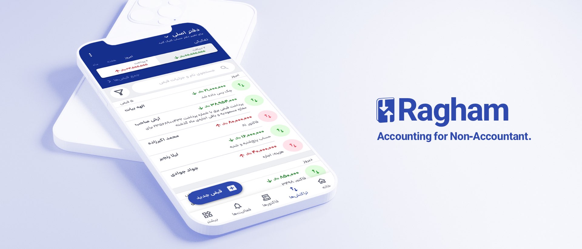
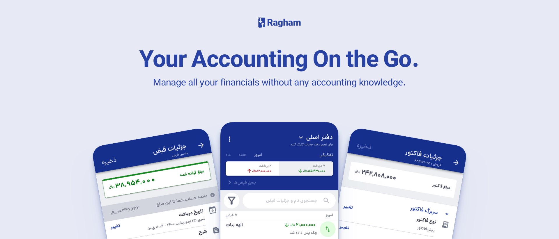
Ragham provides online accounting software for small to medium-sized businesses to manage their finances on the go.
Initially, Ragham offered a feature-limited accounting app that lets users only manage their bookkeeping from within the app (the credits they give and receive). As a result of the app’s simplicity and ease of use, it gained a lot of traction along the way, which led to many feature requests and new business opportunities. In addition, Ragham grew a bit over these past years but lacked a universal design language, and clearly, current design guidelines and assets could not fulfill the new vision.

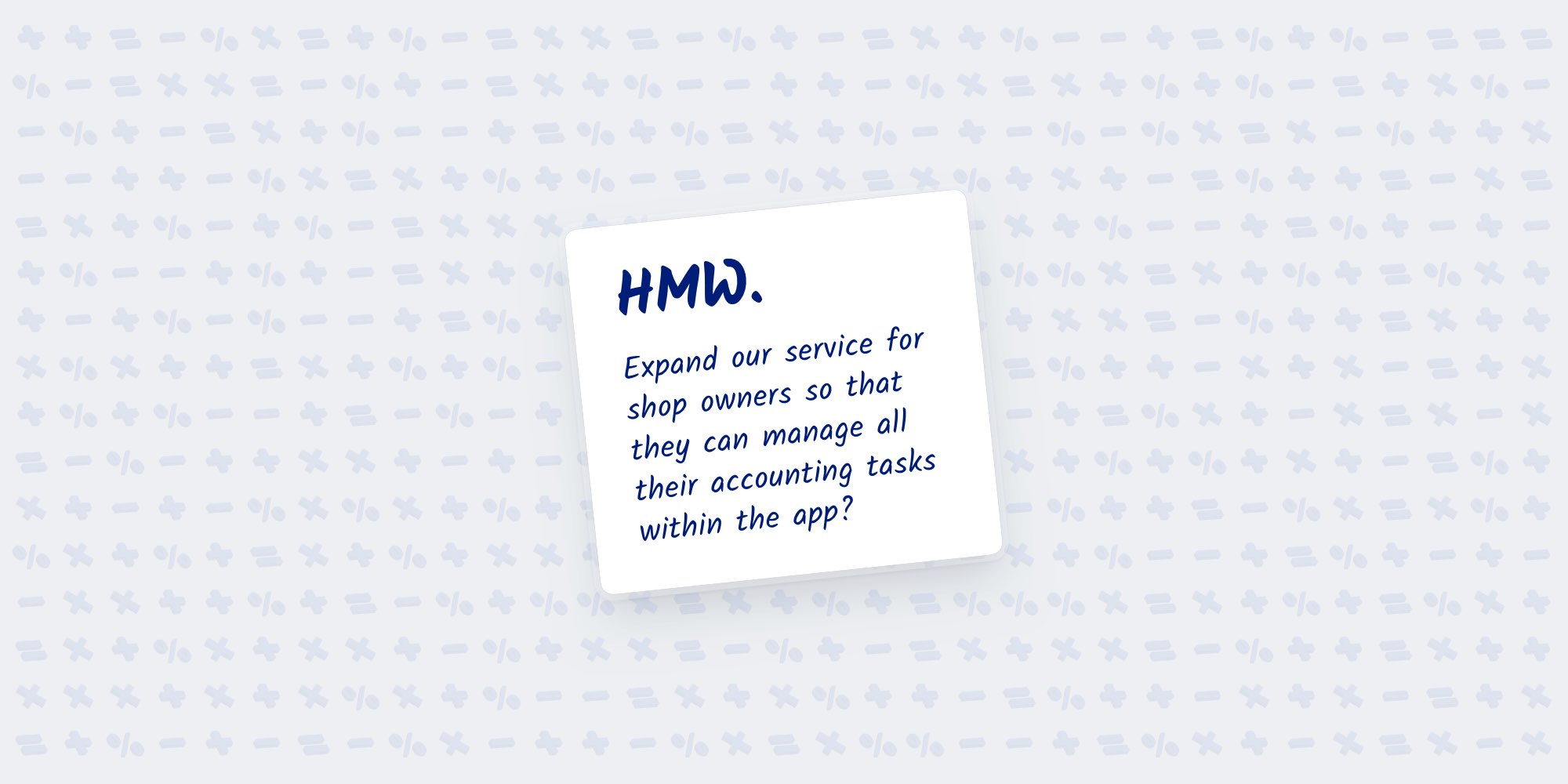
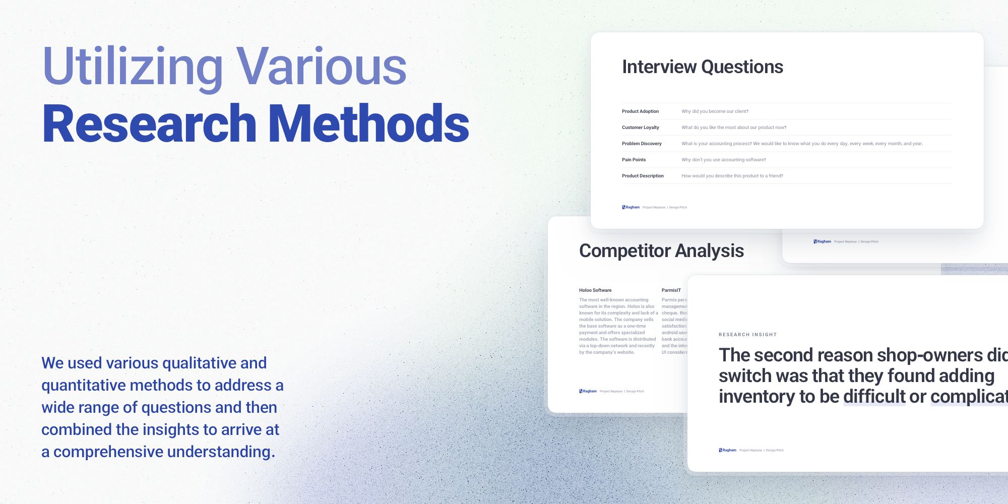
As is common in small product teams, everyone has various responsibilities, and we were no exception. To start with, I had to learn accounting basics, just as any shop owner must. After that, we began to think about the next phase of Ragham and what its future would be. We planned to find the "What," and we asked HMW (How Might We) repeatedly. We also studied and analyzed a broad range of popular competitor products. First, we searched for the questions, and then we ideated upon the problems we might be able to solve.
As part of the next phase, we prototyped our solutions, sometimes just a sketch was enough, and sometimes the test needed a high fidelity design. At the same time, we designed and developed our new design system. Then, we would test all the user flows and the UI designs in the early days of their creation and the day of its completion by conducting usability testing groups.
Users needed the app to perform other tasks as well as credits, otherwise they would have to re-enter what was already in Ragham in other places (whether it was traditional bookkeeping notebooks or software). As we continued our research, we also found that this was the second primary reason for the poor first-month retention rate (followed by the paywall).
There was limited upselling potential due to the absence of extra features. Our company needed a feature-packed accounting application not only for acquiring new users but also to introduce new pricing categories to existing users and ultimately grow revenue with a high ROI rate.
Several sources helped us to answer this question.
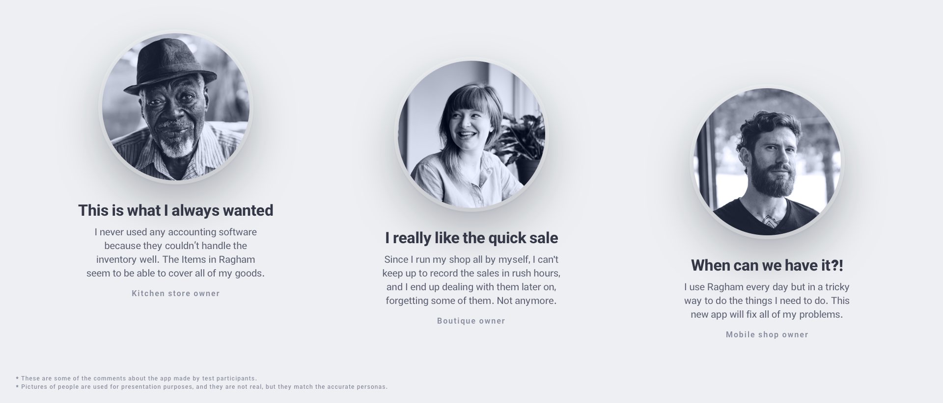
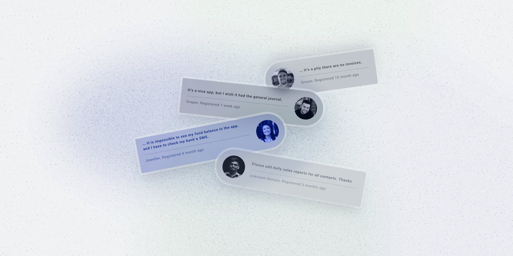
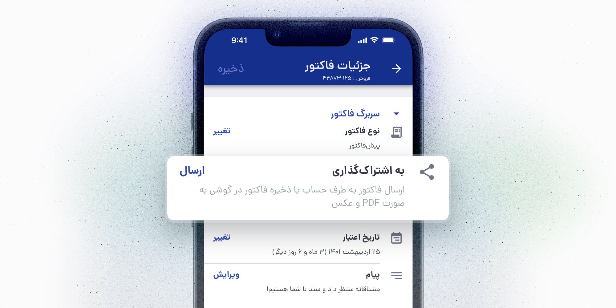
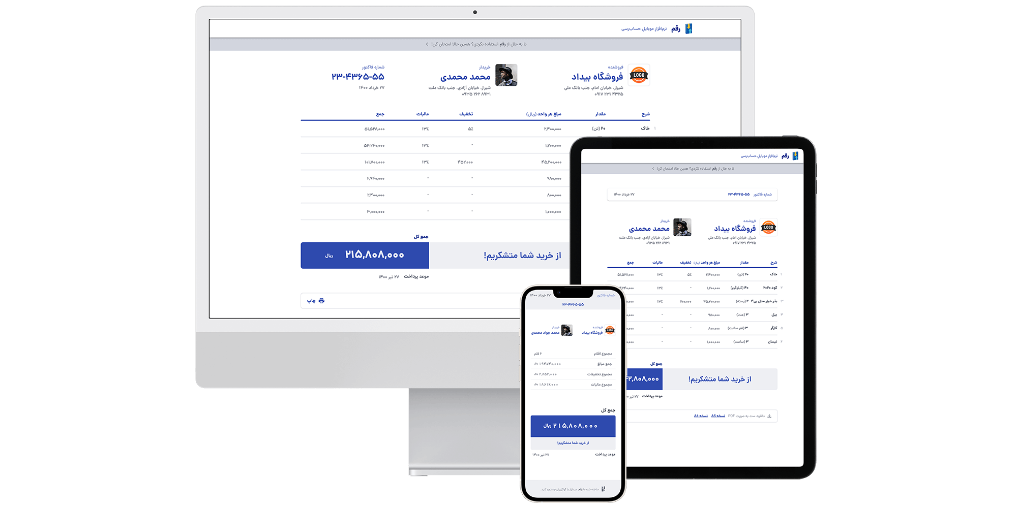
After interviewing users and reviewing the feedback logs, we found that creating invoices had the highest priority as a first and foremost wanted feature. Moreover, our support and sales teams had already recorded other suggestions in the past, so we organized them all to be addressed. There were two approaches to categorizing: one based on priorities, the other on the operation it was associated with. While some of these cases needed or could’ve been taken care of right away, others required more time or were related to the new features we planned.
In our analysis, we looked at a range of products. Some offered a full range of accounting features, and some offered more focused functionality. Some products targeted different markets, and some weren’t on mobile platforms. Aside from accounting apps, we also investigated software with some function similarities, such as e-commerce services.
During this research phase, we examined their product in order to see what problems they are solving and how they are approaching them. We also analyzed their marketing strategies. We carried the process further. To find out what their users think and say about them, we monitored their social media accounts. Also, during our interviews and usability testing sessions, we noticed people discussing and comparing Ragham to other products, so we recorded those as well.
In the end, we documented a comprehensive summary of all their strengths and advantages, as well as their weaknesses.
In fact, this is where it all started. The two co-founders knew growth wasn’t going as well as expected, and new features would trigger the gain. They prepared a list of features and made some assumptions as to what they thought Ragham should have. However, some features were deemed more important than others. We spent quite some time fully grasping all they had in mind. Finally, we decided on a time frame for implementation and key objectives, deadlines, and processes. From there, we began the journey.
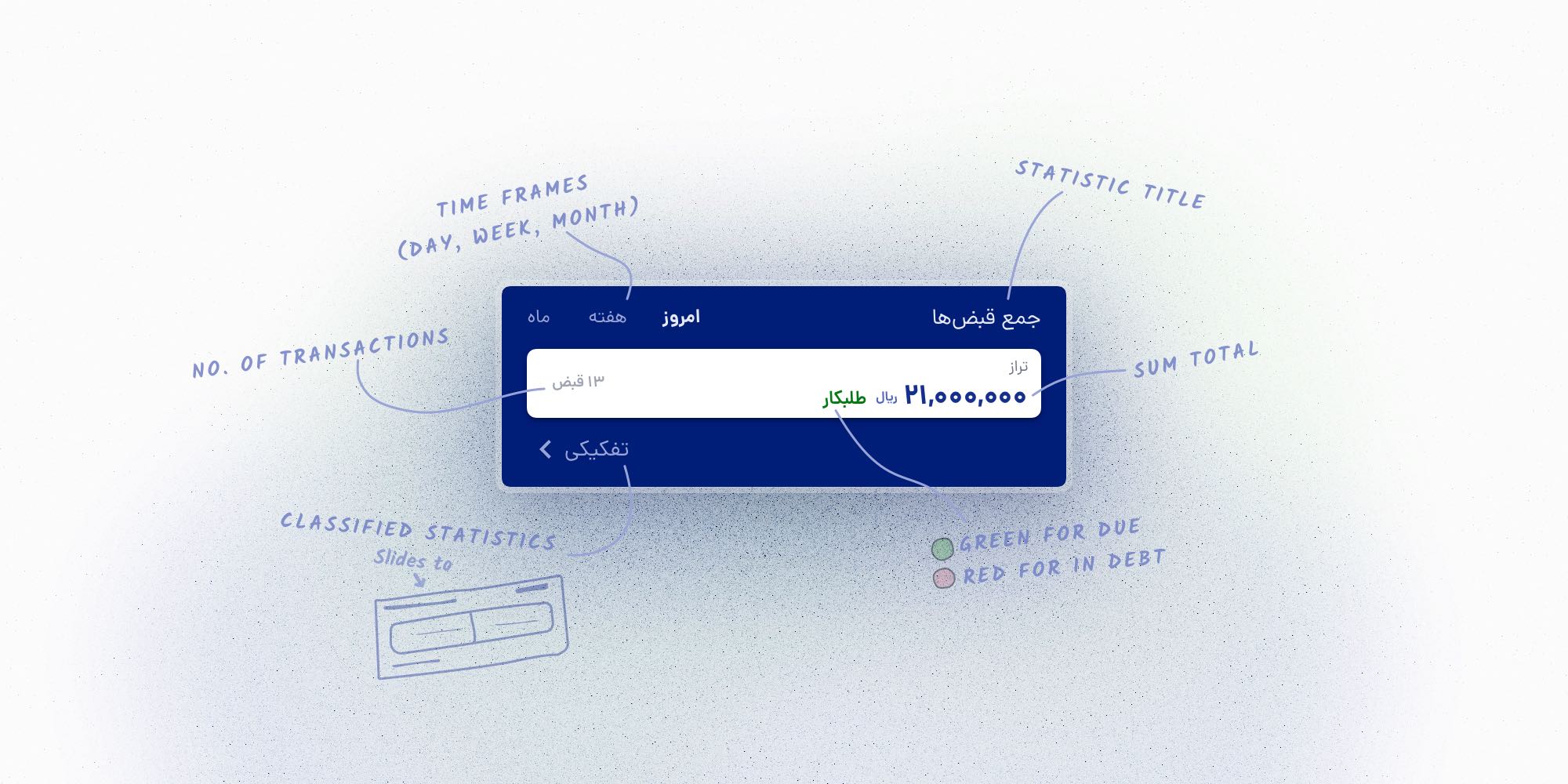
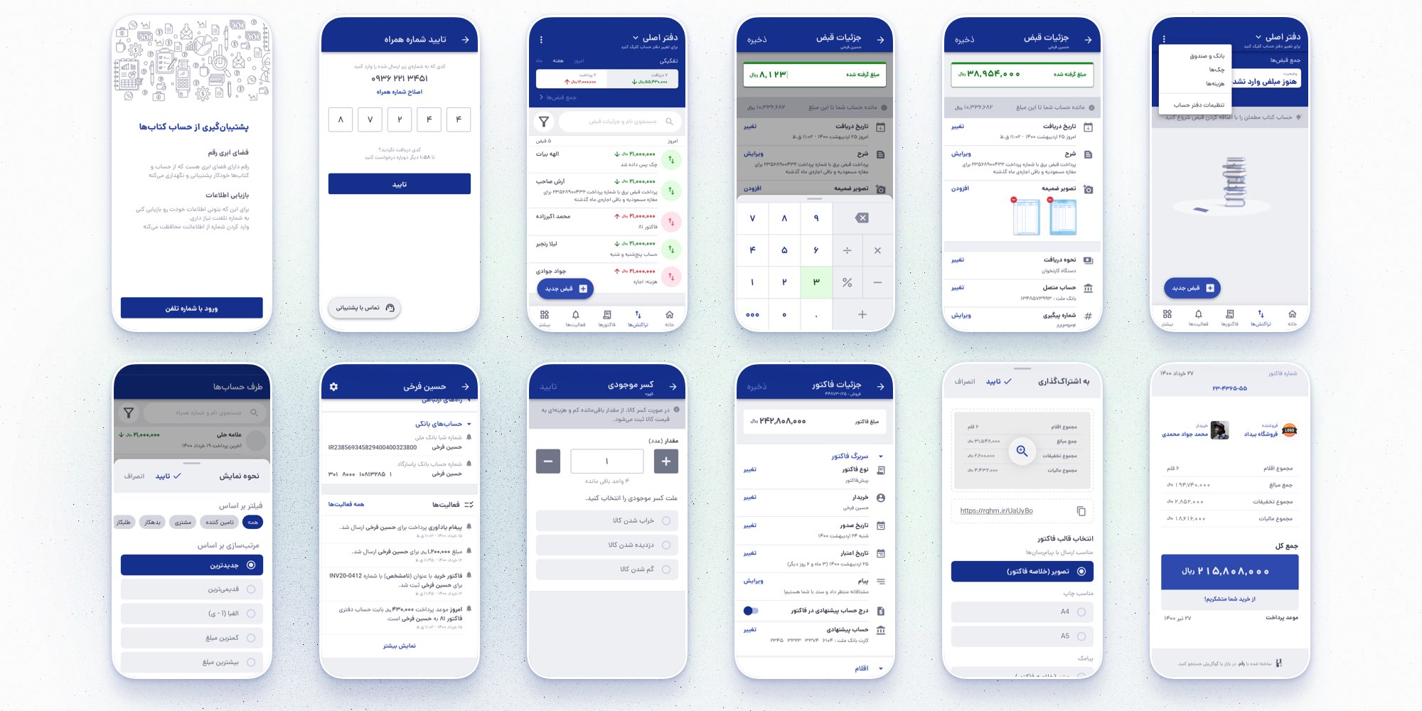
In the previous phase, we identified what our users and business needed. We needed to build an accounting app that was easy to use for people without an accounting background. We had to rethink how our app works for this to happen. Still, we also wanted to preserve and use our design language and user flows as much as possible; therefore, we would be presenting users with the new features much easier, as they already know how to navigate and use them. The goal was to provide them with a richer experience while maintaining familiarity. For example, we had a statistic area where users could see a quick look at their balance, and we took this pattern and enriched it, then utilized it all over other main features we had.
Or as another example, we had two buttons, “Gave” in red and “Got” in green colors. These buttons were already well-known to users, and, in fact, not only are they among our most well-praised design patterns that make our app easier to use, but they also form the app’s visual identity. So we kept it and used it for other purposes.
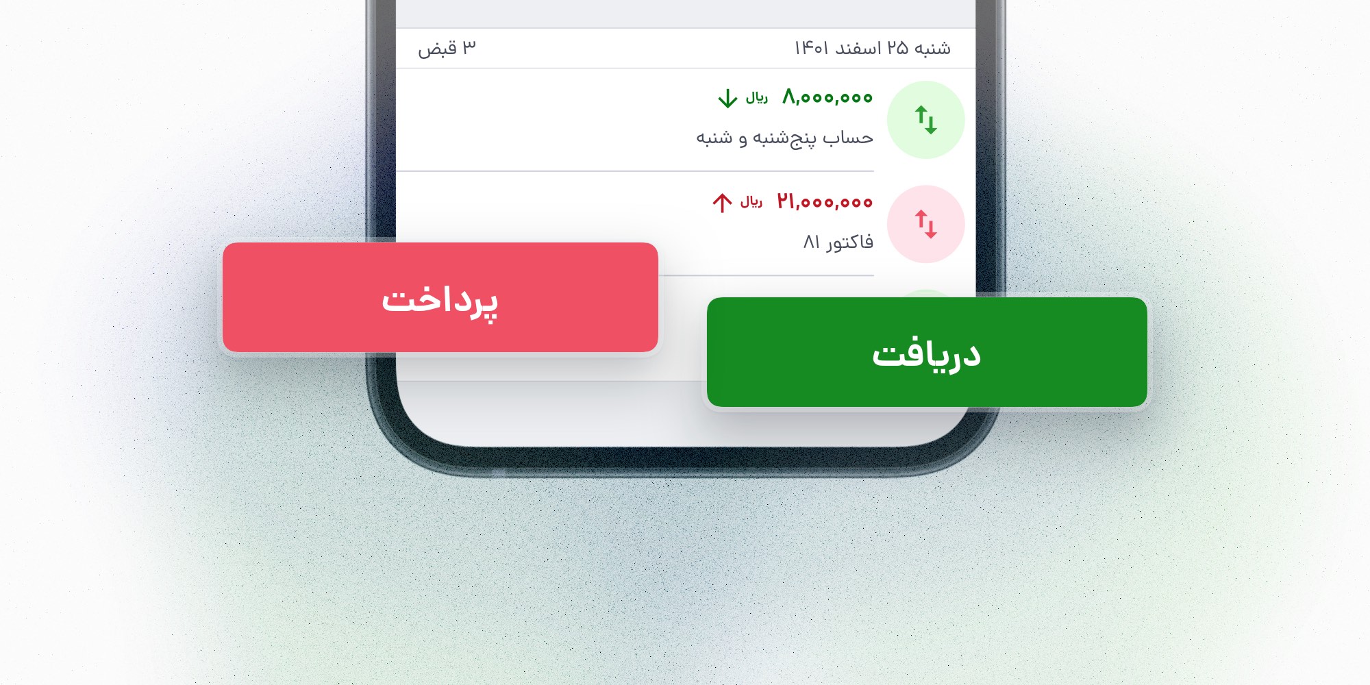
But not everything could have remained the same. We used colors (green for future payments and red for receiving) to indicate whether the user has to pay back or collect. Our research showed that people heavily rely on colors rather than text. Our finding came as no surprise to us, but it posed a significant challenge. In the case of adding other types of transactions, such as sales, profits, and expenses, our color choices would no longer make sense. We had no choice but to make some changes. We prepared our users so they wouldn’t be surprised by these changes. Before implementing the changes, we sent multiple emails to inform them. Additionally, we added temporary alert messages in the app, and through our social media channels, we explained why we were doing this.
We also changed our colors before the new features were available. We did this so they would not feel overwhelmed by new features and all the changes at once.
Furthermore, the support team was ready to assist anyone confused and adjust any accidental mistakes they may have made during the transformation process. It was a bit too detailed for just the color, but that's how it is — great products are born from small details.
Another issue we had to tackle relatively early on was that the design styles were not consistent, and in order to build the new features, we had to make a variety of new components.
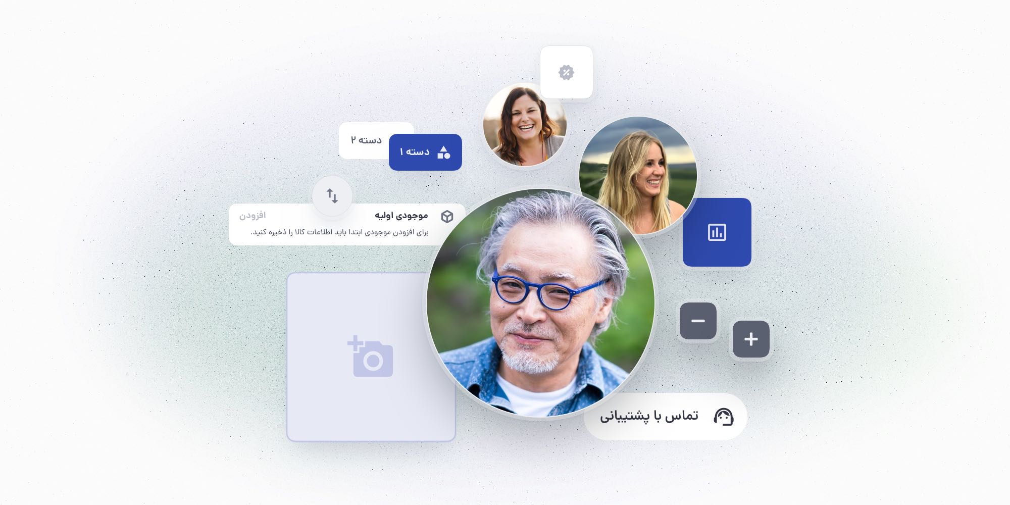
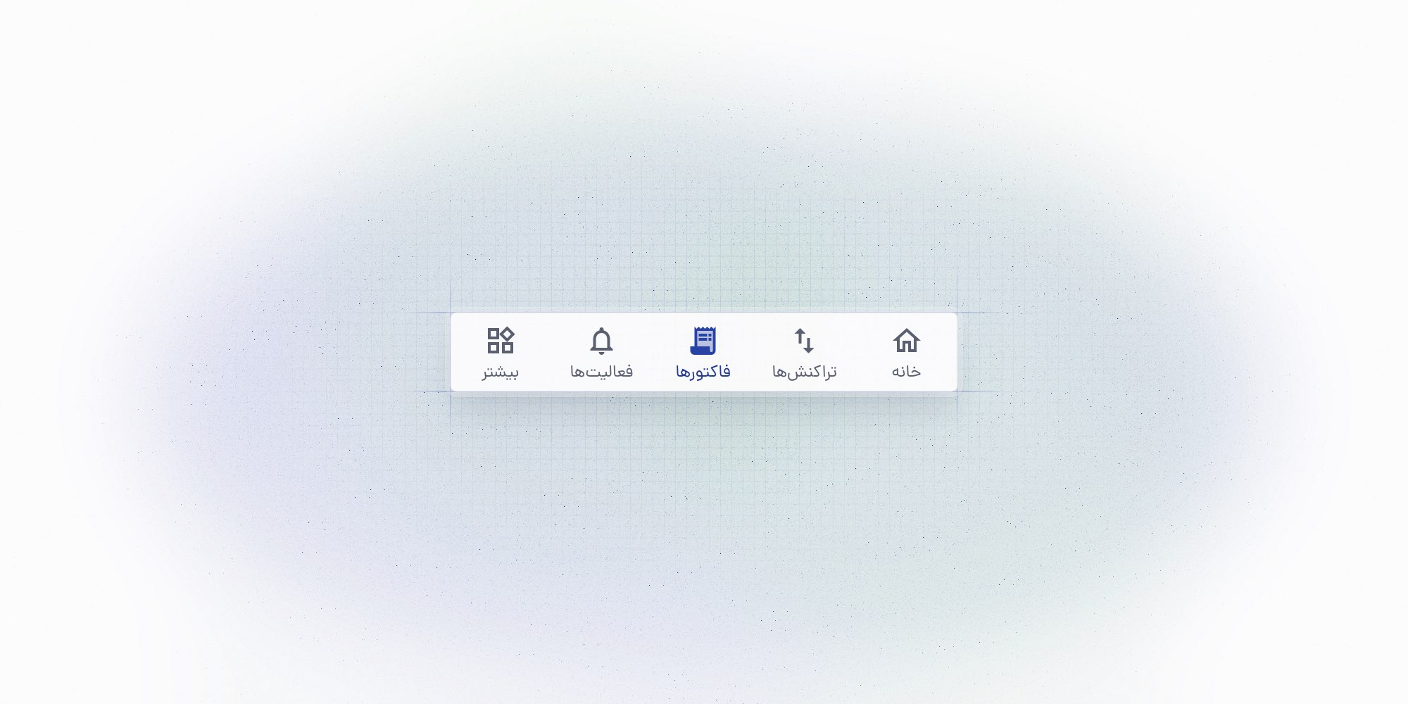
Credit bookkeeping will remain the primary feature (the home in the navbar), with items, invoices, transactions, bank and fund management, etc., as additional features.
Users can navigate in two ways. The first is to go directly to the feature’s page and add an entity. The second is similar to what we already have with the ragham V3, where they go to the list of contacts, then navigate to the specific account and add an entity. The difference now is that they have other options besides credits.
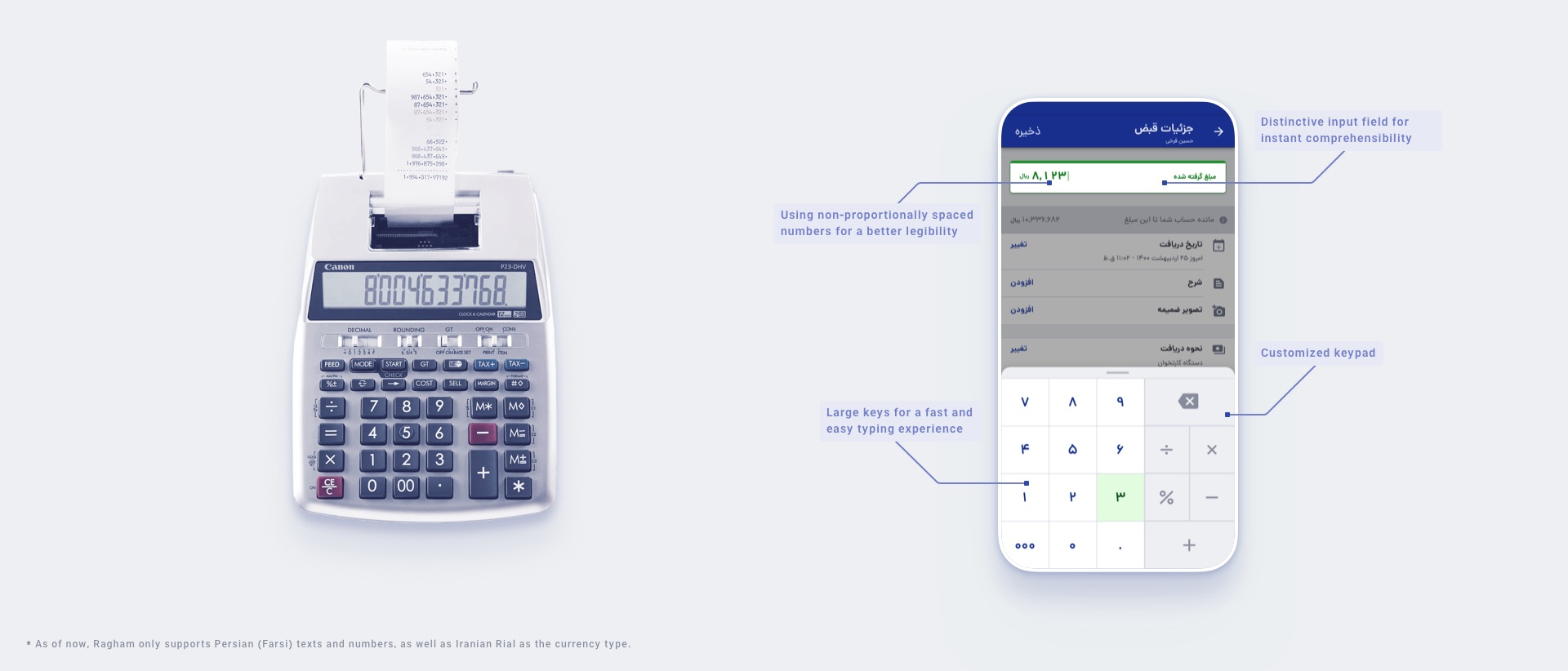
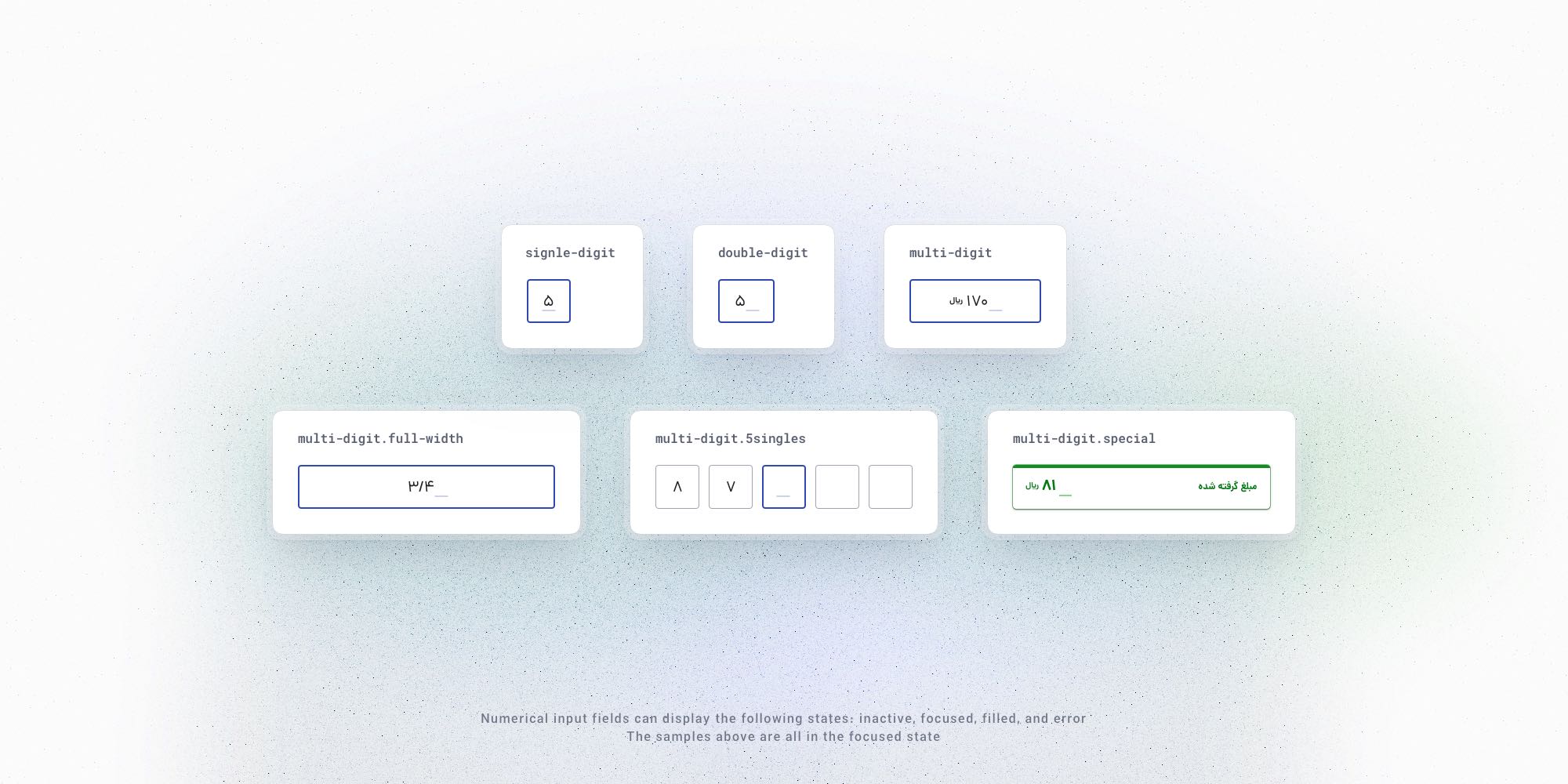
We aim for a product that is easy to understand and comfortable to interact with. To achieve this goal for our number-heavy product, we had to ensure the legibility of numbers with the lowest misreading rate. One instrument we could utilize was the spacing option. We conducted a quick test to determine in a heavy-number design which spacing is easier, faster, and more accurate to read: proportional spacing or tabular spacing (non-proportional). The research showed the numbers with tabular spacing were 30% faster to read with an accuracy of 99% (over 97% for proportional). Accordingly, we opted for the tabular style. Additionally, we increased the font size of the number slightly larger compared to the text to make them even easier to read.
To enhance instant comprehensibility, and as a result, a better intuitive experience, we designed text and numerical input fields differently. In fact, we even had them in various sizes, so users could easily understand how long the number was expected to be.
The redesign and expansion of our app is a work in progress, and we’re not done yet. Considering the nature of accounting and the high responsibilities associated, we are testing the app before it is released to ensure no major problems prevent our users from utilizing it flawlessly. The testing process is intended for accounting calculations and possible faults in our system, as well as testing the user experience.
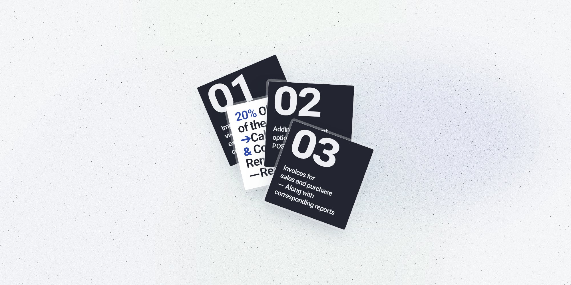
We will roll out the app with all of the following key features on top of the credit bookkeeping:
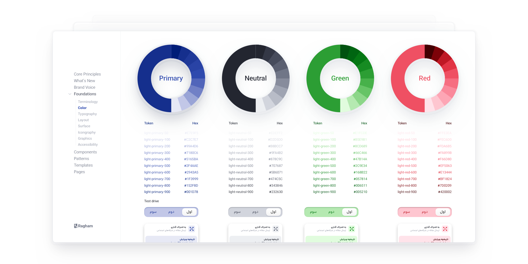
The process of building the design system began with the collection and annotation of design elements across the entire app, from the very basics of colors and typography up to the organism level. We then modified and built new components around them. The development team was also included in this phase to accelerate the overall development process. Naming design tokens and components was a shared task to agree on the same terminology and the design had to be tested for different scenarios in a mock design.
As soon as the design system was ready, we were able to test and implement new ideas faster and more consistently.
Not all design challenges are design challenges, and I learned this the hard way! Communicating is an essential element of the design process. Having learned from past troubles, I strived to avoid absences of communication and misinterpretation in the current projects.
Early on, designing was essentially an isolated task until the final result was almost ready. Once we have decided which problems we want to solve and what the north star is, we will begin the design process. Designers design, managers approve, and developers implement. The order is also always the same. Clearly, this was not ideal and led to numerous back and forth between the design team, management, and development team during different phases, sometimes more than once; consequently, wasting a lot of precious time. This had to change. We got to work to design the design process.
After some iteration and tests and trials, we changed our workflow. In addition to sharing the design early on, we included managers and developers in the crucial design matters, which enabled us to eliminate time waste and enhance productivity. Early feedbacks resulted in quality improvement, and since the entire product team was involved from the beginning, they knew the design well before the hand-off process began.
The unique aspect of our app is that it provides accounting software to people who need to manage their finances but don't have any accounting experience. What did we do to accomplish this?
The project has left me with two important lessons. I learned from my colleagues that I could simply ask users first instead of speculating and ideating for countless hours to solve a problem. And my second takeaway was about getting stuck in a challenge. I remember a quote from one of Jony Ive speeches:
“I love that on Monday there’s nothing there. There is no idea; there is no conversation. The room is silent. There’s certainly not a drawing, and the prototypes are way in the future.
On Monday, there is nothing, but on Wednesday, there is. No matter how partial, how tentative. Now the problem is which Wednesday.”
Aside from the humor in his word, he is indeed correct. There are times when we are stuck on a puzzle, and all we need to do is have patience and trust the process.