1 / 4
2 / 4
3 / 4
4 / 4
Parseh is a leading CMMS (Computerized maintenance management system) B2G/B2B software company with rich service offerings which needed to adapt some of its already established features to work on the mobile platform. Considering the critical tasks their end users would perform and the fact that they are not tech-savvy was a sign of a welcomed challenge. My role was to design a seamless user experience that provided all the features in the app.
Before diving into designing the app, we walked through the steps technicians take to perform their duties; starting from viewing their work orders on the web app all the way to the final stage, updating the work orders in bulk from the data-sheets. Thereafter, I worked with the Parseh development team to understand the software and its logic, as well as how users interact with it, to make sure I designed the whole experience with the slightest difference between the web and app.
Technicians who work in an intense environment and have only a marginal understanding of digital products.
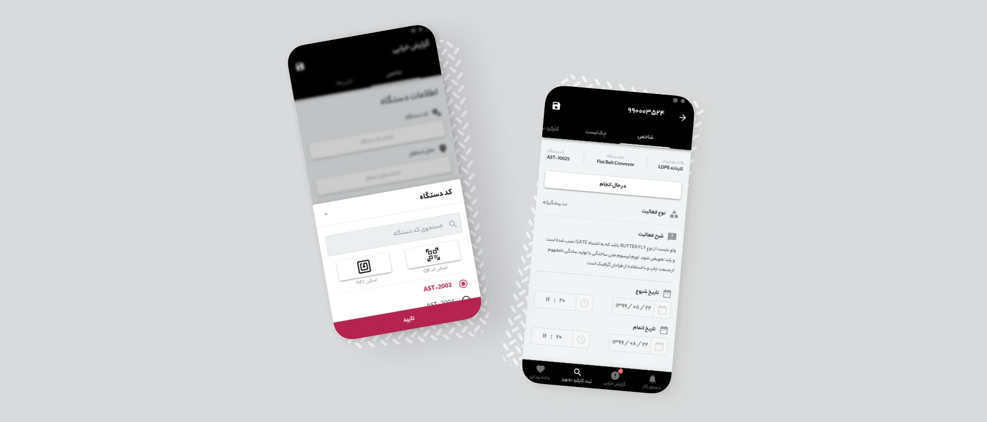
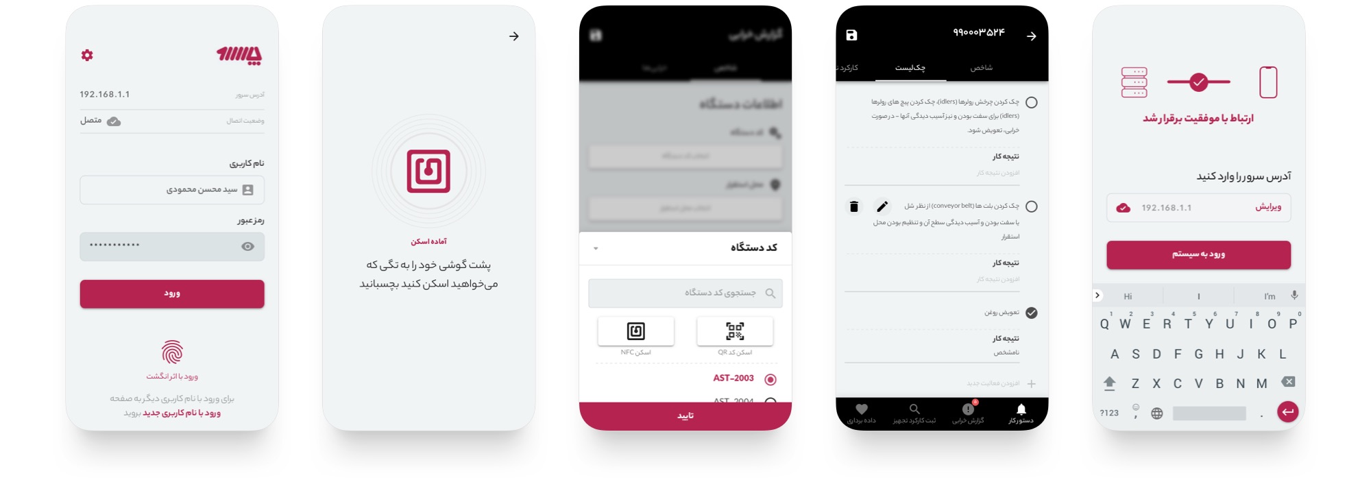
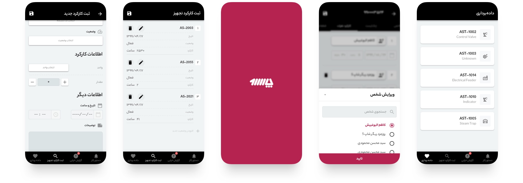
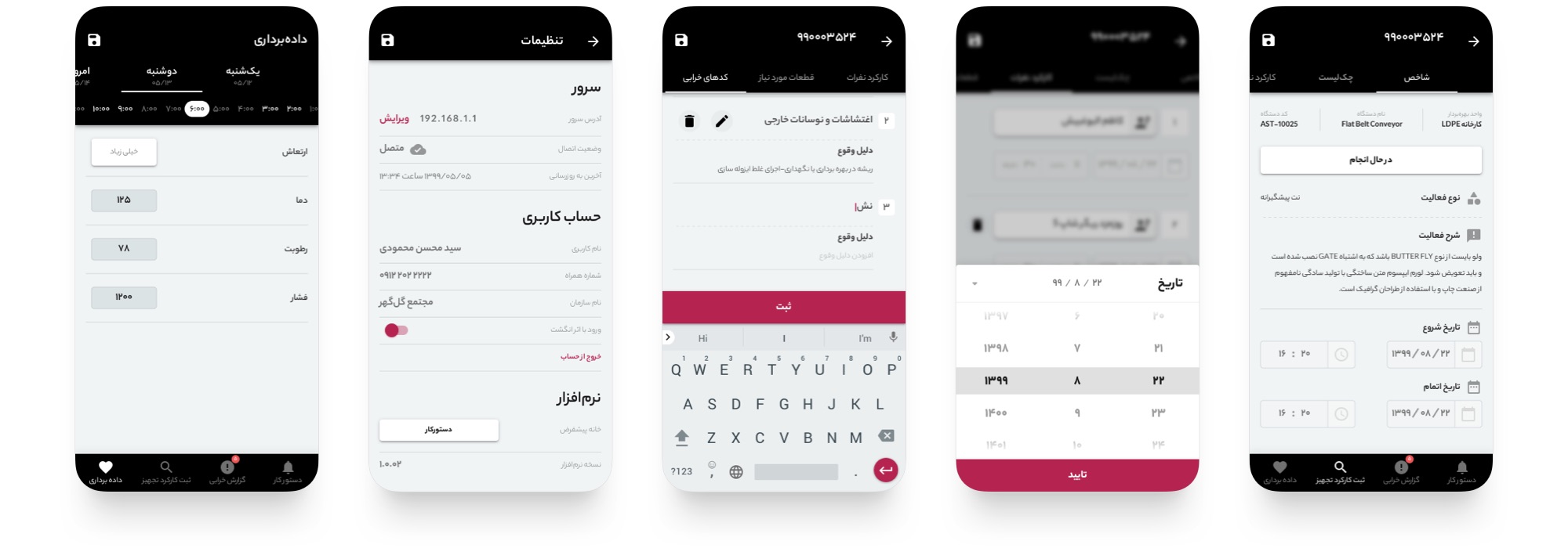
An app that allows users to view and update work orders. Information such as due dates, instructions, checklists, images, manuals, parts, etc., are all accessible.
The app was needed in three stages of any task:
Most often in remote locations with little or no internet access.
The following matters were the reasons for the product's existence as well as the guide to measuring its success.
Why did we choose to use material design components/patterns as much as possible? We followed Jakob’s Law.
Jakob’s Law
Users spend most of their time on other sites. This means that users prefer your site to work the same way as all the other sites they already know.
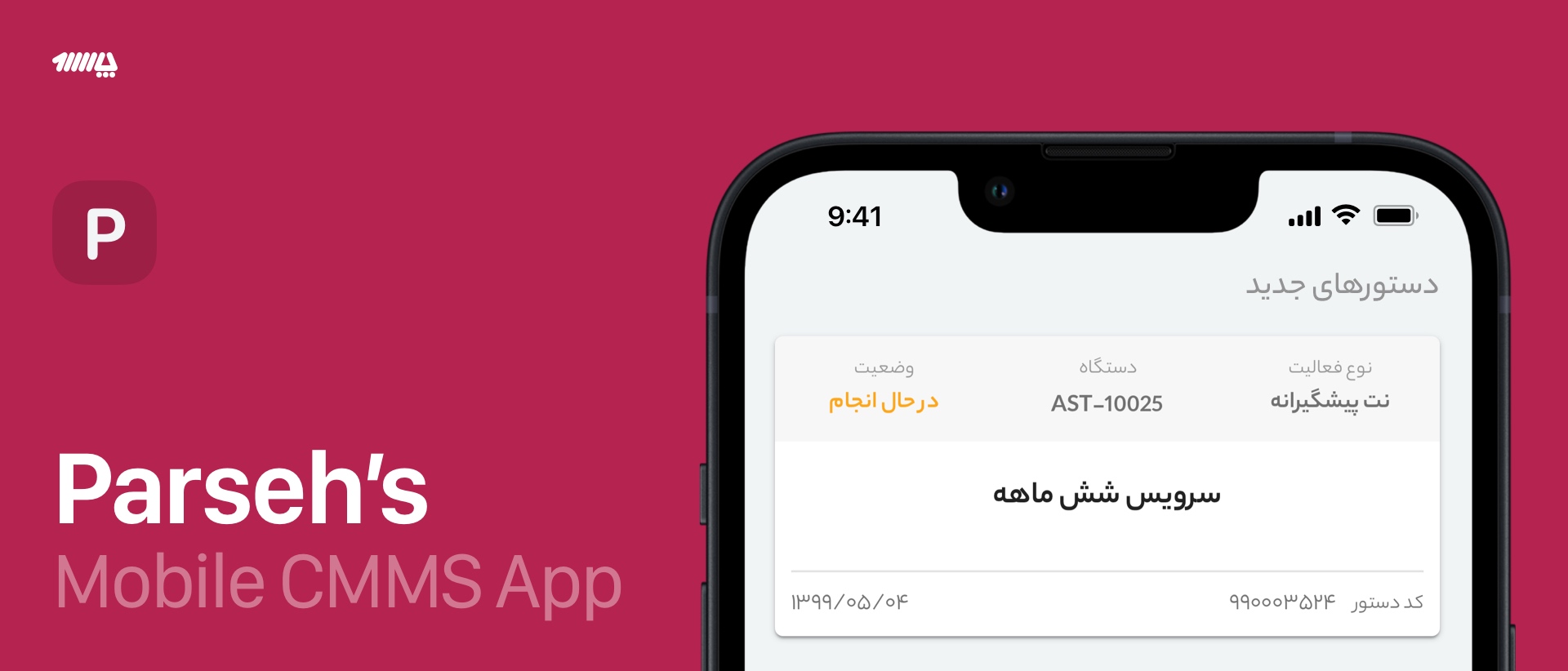
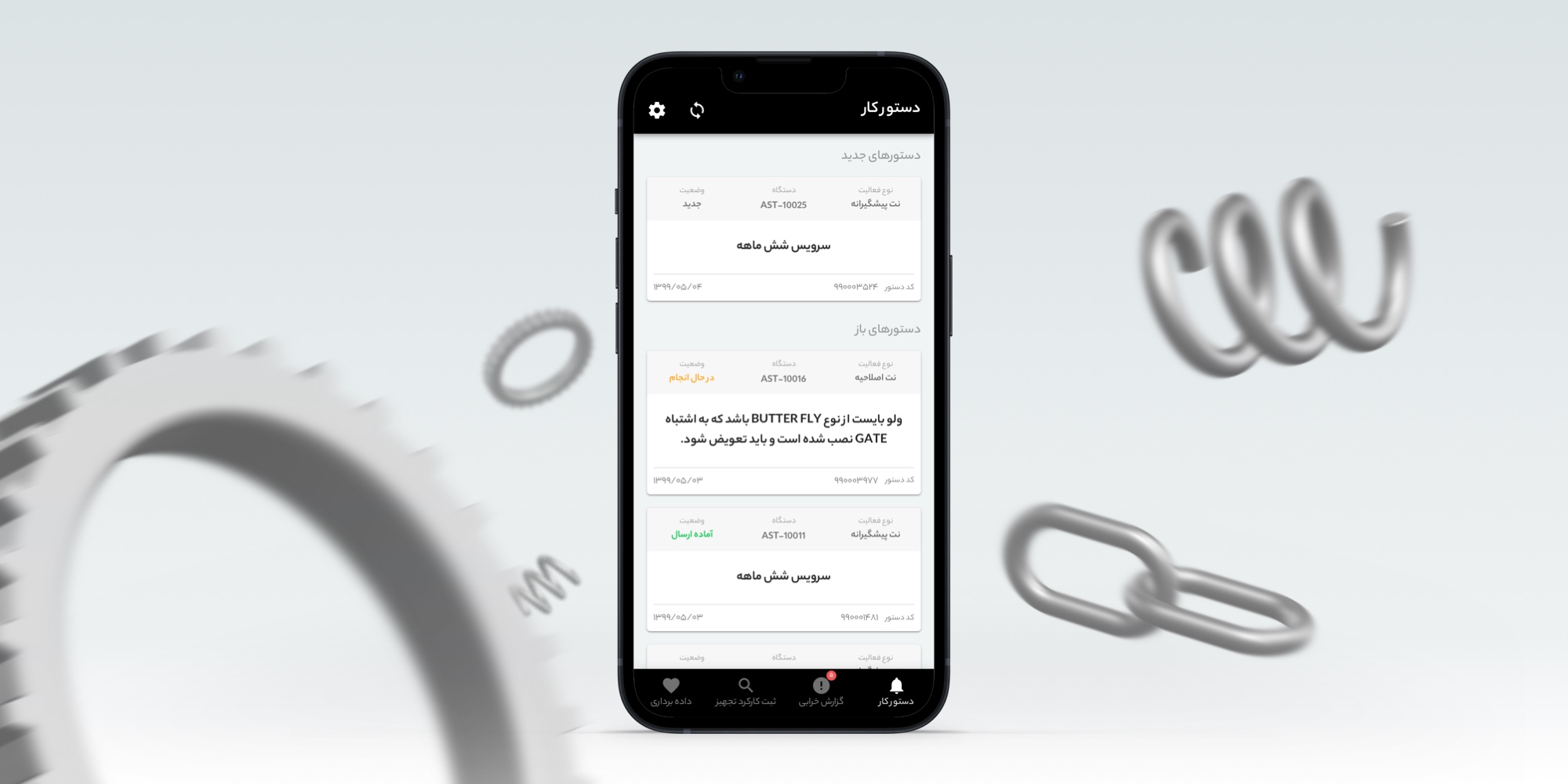
Here is a screenshot of the first page (Work orders), which is kept minimal with cards providing the necessary information. The description is the first and foremost piece of information technicians look for; therefore, it has the highest priority in the design hierarchy, followed by details like the task, device, status, and date.
In our original design brief, we outlined three expectations for the final product: A) Simple, intuitive, and familiar UI B) Easy to use and C) Reliable
Our surveys indicated we accomplished these goals.
As the saying goes: “design is never done,” so we also implemented a funnel analysis to collect data for improving the design as we go.
Credits: Material Design for the Sketch Design Kit and the Material Icons.
In addition, I gratefully acknowledge Mr. Derakhshan for his invaluable insights and practical suggestions.